Your Customizable Data Command Center
Accessing & Setting Up Your Dashboard
-
Go to Admin Dashboard
-
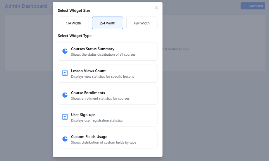
Select Home section
-
Start with a blank canvas to build your perfect analytics view
Available Widgets & Configuration
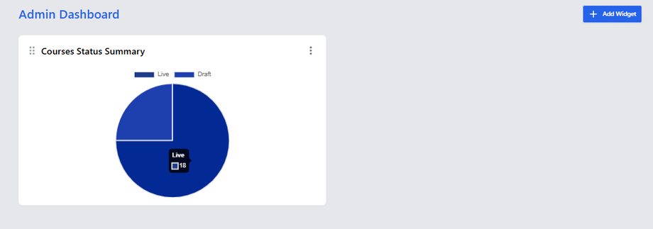
1. Course Status Summary
-
What it shows: Distribution of courses by status (Draft vs Live)
-
Best for: Content pipeline management
-
Size options: 1/4, 1/2, or full width
-
Pro tip: Helps balance your development vs published content
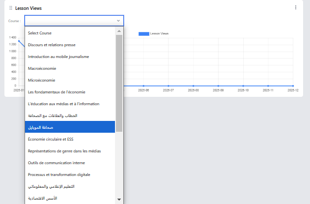
2. Lessons Views Count
-
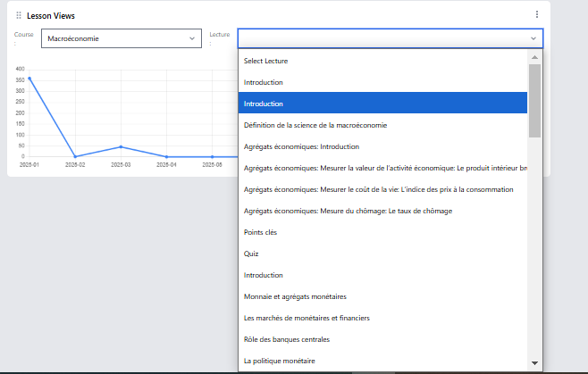
Configuration:
-
Select specific course
-
-
-
Choose lecture to track
-
-
-
Set time period:
-
Daily (select month + year)
-
-
-
-
-
Monthly (select year)
-
-
-
-
-
Yearly
-
-
-
Best for: Identifying most/least engaging content
-
Visual: Line graph showing view trends
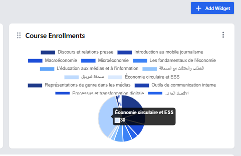
3. Course Enrollments
-
What it shows: Pie chart of enrollment distribution
-
Best for: Spotting popular vs underperforming courses
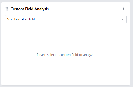
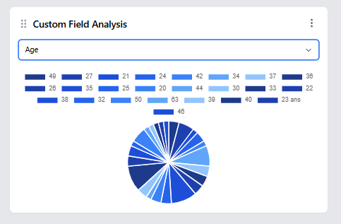
4. Custom Field Analysis
-
Configuration:
- Select any custom field (e.g., gender, location)
- Best for: Audience demographic insights
-
Example: Age distribution across your user base
5. Users Sign-Up
-
What it shows: Registration trends over time
-
Best for: Measuring marketing campaign effectiveness
-
Comparison: Can overlay with course launches/promotions
Dashboard Customization Features
Layout Control
-
Drag and drop: Rearrange widgets anytime
-
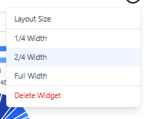
Resize options: 1/4, 1/2, or full width
-
Delete widgets: Remove with one click
Best Practices
✔️ Start simple: 2-3 key metrics first
✔️ Group related widgets: Keep enrollment stats together
✔️ Refresh regularly: Data updates automatically


